Re-design
Messages
Prototype↗
Proven to increase traffic to the Messaging function. 16% more clicks on the Messaging icon and fewer customer support tickets were produced.
.png)
Company
DoraHacks
Timeline
June 2024 -
Aug 2024
Team
1 Operations
1 UX Designer
1 Marketing Specialist
Tools
Figma, Interviews Sketch, Competitive Analysis
My Role
✍️ Optimized the existing feature through re-designing the UX
📊 Identified the user needs and use cases
🔍 Performed user research using interviews, competitive analysis, observation studies, surveys
This project highlights my ability to solve complex information architecture problems, iteratively craft design solutions, and UI mastery.
Problem
❓Nobody uses the Messaging function. In fact, very few users even know about it.
Users go off our product to communicate, losing valuable screen time
Customer support gets a lot of tickets when users do not know how to contact the organizers directly
Discrepancies of this function in our own product
Scope
Target Users:
Hackathon Organizers

-> send out announcements to hacker
-> contact specific hacker for inquires
Hackers
-> message the organizers directly
-> message each other to form teams
Product Requirement:
Improve the UX and UI of the Messaging function across our whole product line
Success Metrics:
Based on the product requirement, I defined the following success metrics:
-
⏰ Time spent on Messaging function
-
✉️ Messages sent across the whole site
-
👫 More team formation in Hackathons
-
⬇️ Less customer support tickets on how to contact the organizers
Ideate
Because the product requirement is clearly outlined and based on user data. I combed through the preliminary research data and started to ideate the solutions.
👀How might we bring more exposure to the Messaging function?
❓Current:


Looking at the current Messaging function, I identify several ways it could be improved:
-
The entry point for the Messaging function is not prominent -> low visibility
-
The floating window is too small for users to interact -> awful user experience
-
Discrepancies across the whole product: Mail or Message? -> Confusion
📚 Inspirations:
I then took a look at how other products' Messaging function look like and did competitive analysis regarding the several problems that I identified with our current product:

Airbnb: Host & Renter
✅ Dedicated messaging page
✅ trip information card to the right
✅ Icon displays unread number

Facebook: Friends
✅ Different colors representing sender
✅ Filter function to organize
✅ User actions to the right

Reddit: Users
✅ Floating window
✅ Good for short messages
✅ Users could multi-task
Taking our users' specific needs and our visual style into consideration, I started prototyping.
Hackathon Organizers
-> send out announcements to hacker
-> contact specific hacker for inquires
Hackers
-> message the organizers directly
-> message each other to form teams
💡Interview
7 Participants
988 dispatchers, deaf community event organizer
Prototype
💡 Design Solution: Icon Change


In order to make the icon represent the function, and distinguish it from the email icon currently used on our website. I designed a new icon with different states
The new sets of icon can:
-
represent how many unread messages are
-
change when new messages come, draw more attention
-
solid & outline icon in different scenarios

REPLACE THIS!


Before:
no new message indication, notification > messages

After:
show how many new messages, messages > notification
💡 Design Solution: Messaging Interface Re-design
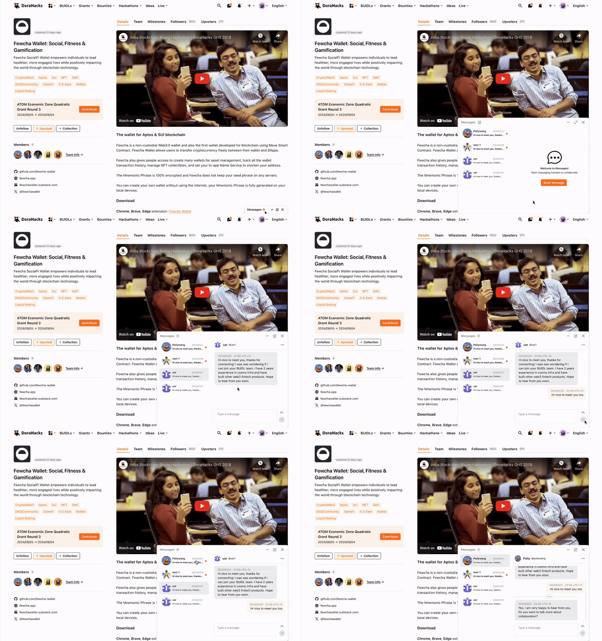
✍️ Iteration I: Floating window
In order to keep the floating window interaction to introduce as less friction to users as possible, but also improve the existing painpoints, I decided to change the flowing window's position and size.

Sketch - minimized window

Sketch - floating window
New Message (Default)

Open read & unread messages


Draft a new message:


User Flow:

Prototype:

💡Testing and feedback
I quickly ran some casual user testing sessions with the operation analysts and designers at our company to facilitate the iteration process. Here is the feedback I got:
-
Interaction perspective: floating window doesn't work -> I clicked banner and it appeared down there?
-
Technical perspective: harder to implement
-
UX perspective: double column design is good -> facilitates multi-thread replying
-
UX perspective: search users is good -> display following users first
An important observation I had during the usability session is:
Our users often draft long messages using the messaging function. Most of the time, the floating window is too small to allow them to see the entirety of their messages.
✍️ Iteration II: Dedicated page
New Message (Default)

In this iteration, I kept the two-column design of the previous iteration but dedicated an entire page to the Messages function. To better assist users in inputting long messages, I also implemented other functions.
Typing Interface


-
Automatically overflow text input box
-
Users could also click the button to expand the text input box to maximum height, assisting them input longer messages
New Chat


-
Display following users first in the dropdown, adding a description in each row
-
Add user intro & follow button in the top bar
🧰 Components!


🧰 Grid & Breakpoints

User Flow:

Prototype:

💡Testing and feedback
-
Interaction perspective: the text expand button is useful!
-
Technical perspective: easy to implement, could build on existing framework
-
UX perspective: love the search messages function!
-
UX perspective: automatic overflow helps user navigate
If we recall, there are two groups of users I am designing for: the organizer and hackers. The organizers' messages often contain important updates and anncoucements. Hence I ask:
👀 How might we prioritize organizer vs. hacker messages?
✍️ Iteration III: Organizer badges and filter
Organizer Badge


In order to better distinguish organizer messages, I introduced the organizer badge next to the user name, and users could click it to go to the hackathon details page.
Filter


I also introduced the filter function for users to sift through their messages efficiently.
Spoiler alert: this function is actually put into the next release, as we are gaining more traffic to the Messaging function. As of current our users don't have that many messages to filter.
💻 Final deliverables
User flow:

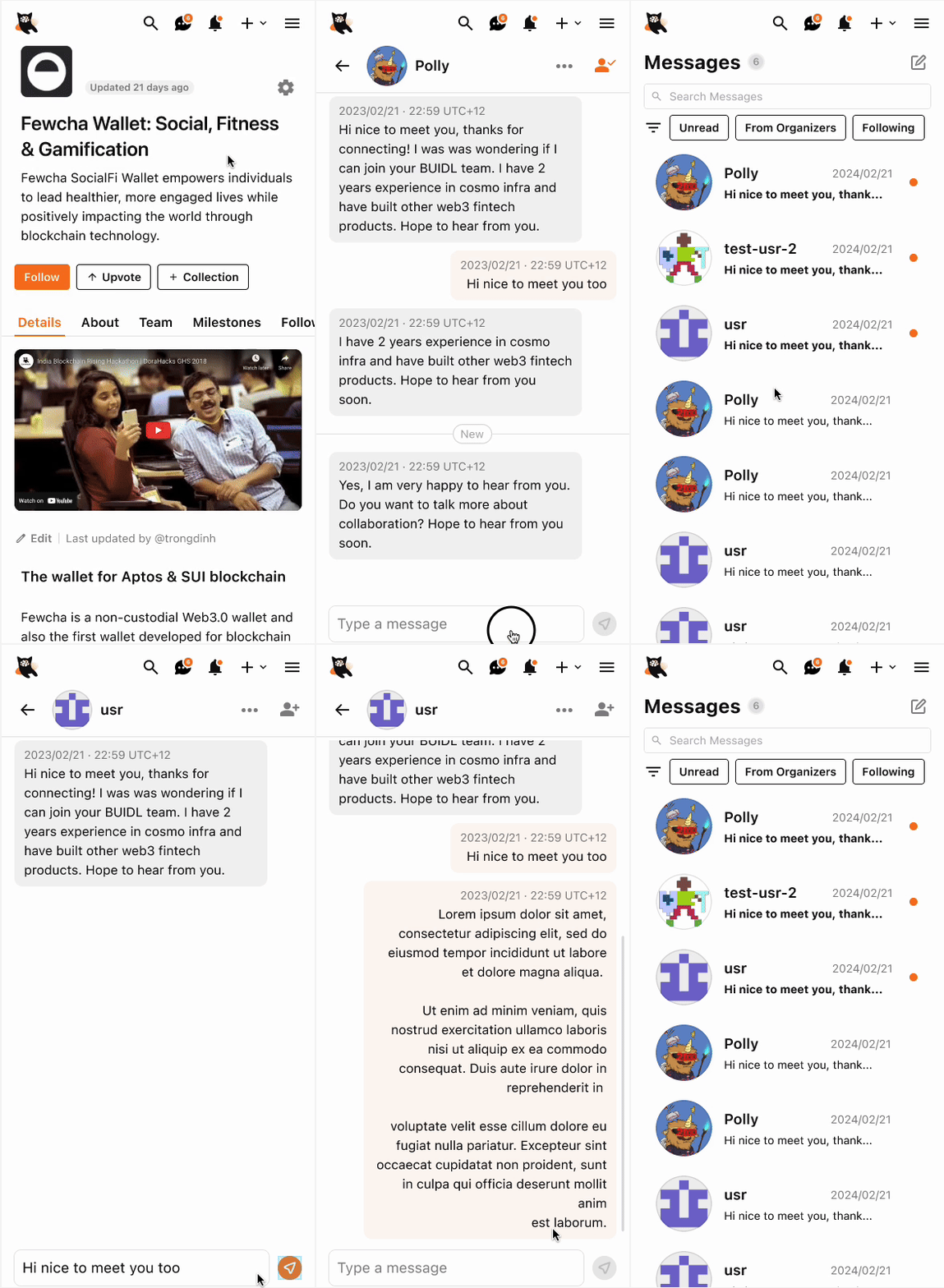
Responsive layout:

390 (Mobile)
1920
960
Desktop Prototype:

Moblie (Web App) Prototype:


Impact & Learnings
✨ Impact
-
Shipped!
-
Proven to increase traffic to the Messaging function
-
16% more clicks on the Messaging icon
-
Fewer customer support tickets were produced. since its launch
✨ Learnings

Sometimes users cannot vocalize/request features that they need. As a designer, it is our job to identify areas of improvement based on the interaction we observed.
In this project specifically, earlier feedback for the text expand button is negative, deeming it unnecessary. However, only by understanding the real problem and user goal can you design a product that users actually want.
Users love the expand button :)))